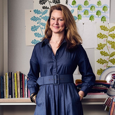
For readers discovering you for the first time, how would you describe your artistic philosophy and the signature elements of the Molly Mahon brand?
The brand celebrates craft, colour and the imperfect charm of the block print. I’m drawn to rhythm and repetition, patterns that feel joyful yet grounded, expressive yet timeless. Working primarily with traditional block printing, each design carries the trace of the hand and the moment it was made. Everything we create is designed to bring warmth, personality and a sense of story into everyday life; pieces that feel personal, collected and enduring.
At its heart, my work is about creating beauty that feels human, soulful and lived-in. My journey into block printing didn’t begin in a studio or through formal training, but at my kitchen table with my children playing beside me—through curiosity, instinct and a deep desire to make things by hand. I taught myself by doing, and allowing the process to unfold slowly and organically. That sense of discovery still underpins everything I create today.
What initially drew you to block printing and surface pattern design?
Block printing captured me from the first moment I lifted the block at a workshop I attended. I was fascinated by this art form that is both ancient and alive. It instantly captivated me. The process is slow, physical and deeply intuitive. Every mark carries the hand and the moment it was made. I loved that it allowed me to combine drawing, colour and storytelling, while working in a way that feels honest and tactile in a world that often moves too fast.
Where do you find inspiration for your motifs, shapes and color palettes?
My inspiration comes from many places—wild gardens, old textiles, painted floors, folk art and the quiet poetry of home. I’m endlessly inspired by the way colour appears in nature; lichen on stone, bright blooms, the glow of dusk. My travels, particularly through India, have ignited a fearless love of colour, while the vibrant patterns of Rajasthan opened my eyes to the joy and possibilities of pattern-making. It is these moments that become starting points for designs and palettes.
How do nature, home, and travel influence the mood and energy of your work?
Nature gives my work its grounding, travel brings energy and curiosity, and home provides intimacy. From the colours and chaos of Jaipur to the calm of the British countryside, each place leaves an imprint. I want my designs to feel collected rather than curated, and layered with memories and emotion.
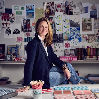
Could you walk us through your creative process—from your first idea to a finished print?
It often begins with drawing, followed by refining motifs into repeat patterns. I think deeply about scale and movement—how a design will feel when it wraps, folds or hangs. From there, blocks are carved by hand, and colours tested repeatedly in our studio until they feel just right. There’s a moment when the print suddenly feels alive, that’s when I know it’s finished. My heart will skip a beat.
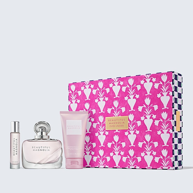
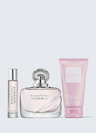
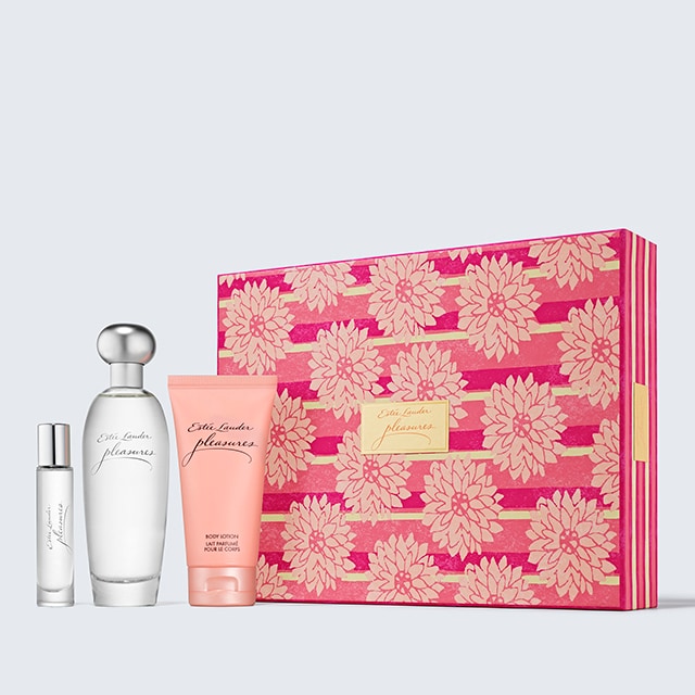
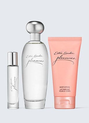
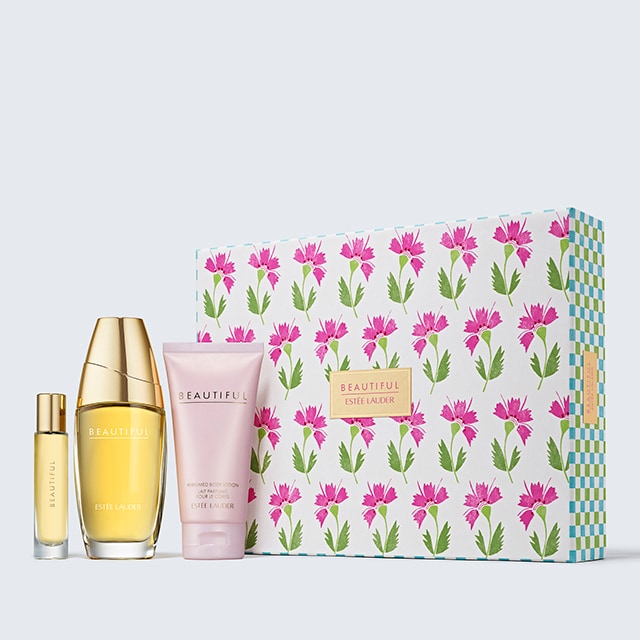
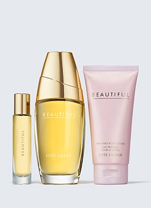
What inspired you about partnering with Estée Lauder to create the prints used on our spring gift sets?
Estée Lauder represents heritage, elegance and a deep understanding of ritual, qualities that felt beautifully aligned with my own values. I was inspired by the idea of translating hand-crafted artistry into a luxury beauty context—creating something that feels both elevated and heartfelt.
How did you think about designing artwork that would elevate the unboxing and gifting experience?
I wanted the prints to feel like an immediate moment of joy, something that feels special before the box is even opened. Pattern has the power to create anticipation, and I thought carefully about how colour, movement and detail could enhance that sense of ceremony and indulgence.
Are there particular motifs, colors or details within the prints that feel especially meaningful to you?
Yes, there’s a gentle play between organic florals and rhythmic patterning that feels very true to my work. The colours are fresh but softened, with a warmth that feels generous and uplifting. They’re designed to linger in the memory, not shout for attention.
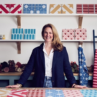
Block printing is a wonderfully tactile and human craft. What do you love most about working by hand?
I love the unpredictability. The slight variations, the imperfect alignment, these are the moments where the work feels alive. There’s a connection between hand, heart and material that simply can’t be replicated digitally. I relish the time I spend in our Delhi studio working with the master craftsman who have honed the skill of block print over years. It is here that the magic really happens—I feel incredibly proud watching the patterns cover the cloth.
How do you balance traditional artisanal techniques with modern creative opportunities?
For me, tradition is a foundation, not a limitation. I respect the craft deeply, while exploring new applications, scales and collaborations that bring it into contemporary life. It’s about honouring the past while designing for how we live now. It is wonderful to see the creative journey culminate in a set of curtains or on the walls of someone’s home.
Gifting is at the heart of many of your designs. What role does the idea of gifting or celebration play in your creative work?
Gifting is an act of care, a way of saying “I thought of you.” I’m always designing with that moment in mind: birthdays, milestones, small everyday celebrations. Pattern can elevate these moments, making them feel considered and meaningful.
When you imagine someone receiving a gift wrapped in your prints, what feelings or experiences do you hope it evokes?
I hope it feels joyful, generous and deeply personal, like something chosen with intention. A sense of delight, but also comfort. Something to be kept, remembered, perhaps even reused.
Spring often symbolizes optimism, renewal, and brightness. How did seasonal themes influence the prints you created for our packaging?
Spring guided everything, the sense of lightness, freshness and gentle optimism. I wanted the prints to feel uplifting but refined, capturing that moment when the world begins to open up again.
What emotions or stories were you hoping to capture through the color choices and patterns in this collection?
There’s a quiet happiness woven through the designs, a sense of renewal without being overt. The colours tell a story of warmth, hope and softness, inviting you to pause and enjoy the moment.
Do you have a favorite print or pattern from this collaboration? What makes it special to you?
The floral prints in particular feel incredibly balanced, playful yet elegant. It captures so much of what I love about pattern: movement, harmony and warmth. It feels timeless.
Is there a particular moment or memory from the creative process that stands out?
Seeing the artwork translated onto the final packaging was incredibly special. There’s always a moment of quiet excitement when something imagined becomes real, especially at this scale and level of brand.
What’s inspiring you at the moment, and how do you see your design work evolving in the coming years?
I’m increasingly inspired by depth over speed, exploring richer palettes, layered patterns and more immersive applications. I see my work continuing to move across interiors, objects and collaborations that value longevity and soul.
Are there new materials, techniques or collaborations you’re excited to explore?
Absolutely, sustainable materials and thoughtful partnerships are central to everything we do. I’m excited by opportunities that allow craft to appear in unexpected places, always with integrity and beauty at the core.
If readers take away one message or feeling from your prints featured on our gifting collection, what would you hope it to be?
I hope they feel joy, a quiet, lasting joy rooted in beauty, care and craftsmanship. Something that feels generous, uplifting and deeply human.